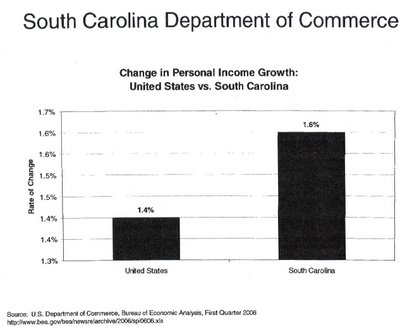
This is one of several charts Sanford handed out to the press after his cabinet meeting last week. After BLS announced SC has the second highest unemployment rate in the nation, the Sanford economic team went into high spin gear, trying to come up with statistics that refuted what everyone knows: South Carolina’s economy is in trouble.
One of their most touted pieces of evidence was that SC’s personal income grew by more than the national average in the first quarter of 2006. Here’s the chart they passed out on this, and it sure looks impressive! Wow! Our personal income looks like it grew three times more than the rest of the country!
Until you look at the actual numbers. (Look especially at the numbers on the left – notice anything unusual?) The other thing, all members of the Sanford team began saying was that the unemployment numbers must be wrong. Maybe it’s because they’re all using the same new math they used for this chart! (This was said at different times by Gillespie, Taylor and Rainey, and Sanford said he would request that a review be done on them, but not until after the election because otherwise it would be political fodder. They already requested a review a year or two ago; it was done and the conclusion was that the numbers are correct.)
This deceptive chart was actually distributed by our Governor and his economic team. Of course only a couple of days later, The State reported on yet more discouraging numbers (Wages drop in most of S.C.; http://www.thestate.com/mld/thestate/15131891.htm)


